It’s so cool to see how toys change over time—and at first glance easy to think that blocks surely don’t change so much. Even within Grimm’s, it’s fascinating to watch the sets evolve. Before Grimm’s was “Grimm’s Spiel und Holz Design” they were “Spiel & Holz Design” –the original logo didn’t have a rainbow.
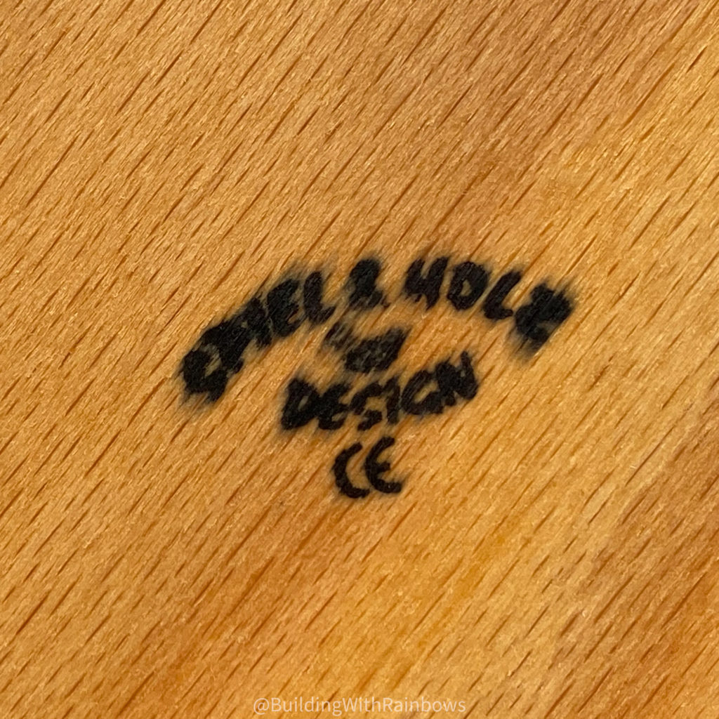
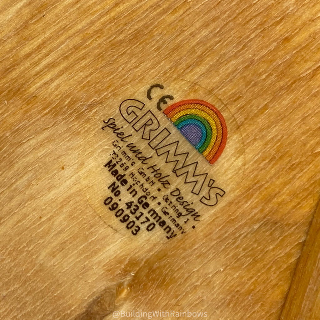
I haven’t cracked the tomes on this one—no deep research—but let me share what I’ve noticed in my years playing with and admiring Grimm’s.
The original toys and puzzles from Grimms were made with a different colorant than they use today. The colors were different, and they were more prone to color transfer.
The pieces below are from the same set (curves—a now-retired set), check out the difference in colors between the same pieces, one each from one of the older and newer versions of the set (old on the bottom in all cases). You can also see significantly more color transfer on the older set, despite the fact that we got that one new-in-package and only a little bit before we got our second set, which was gently used when we got it.


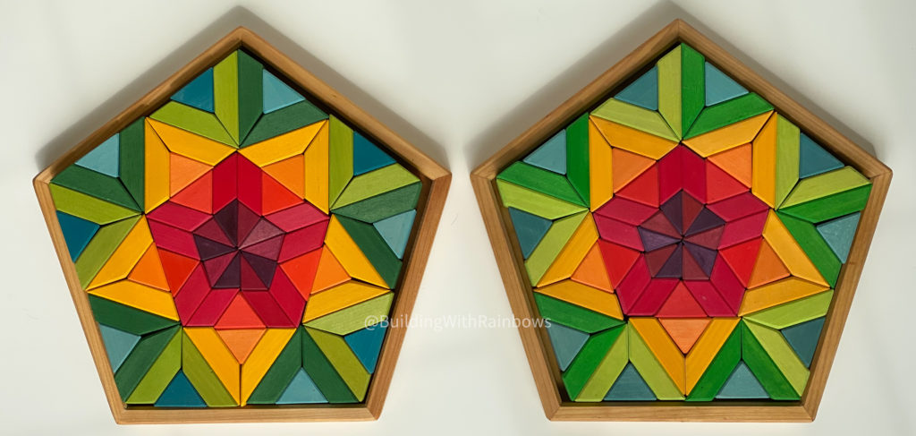
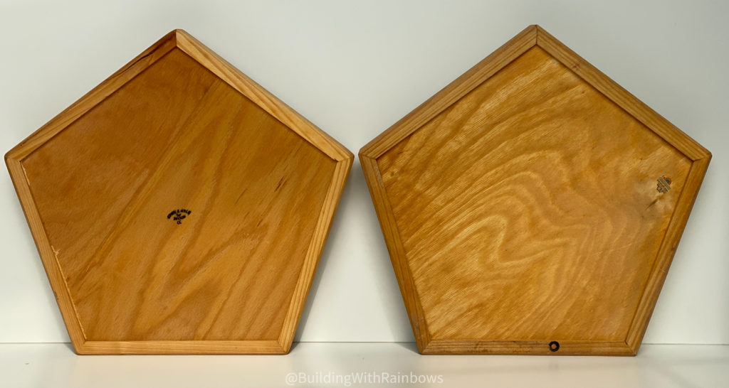
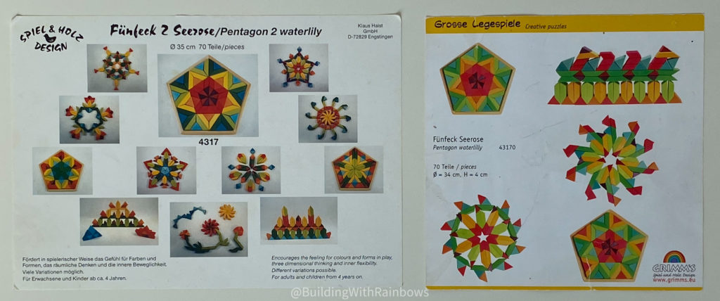
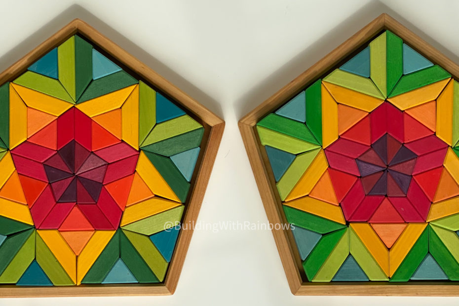
These two Waterlily puzzle sets show off the change in hue across the range of colors. The left is from the pre-Grimm’s era, and the right has the Grimm name.
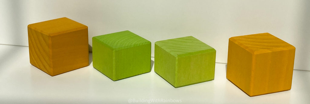
More recently Grimm’s has also changed the style of their blocks. Originally all edges on each 4cm thick pieces was chamfered, but in newer sets the top and bottom edges are chamfered, and the vertical edges are not–its subtle, but there’s a difference. All of these are from the “Grimm’s” era, but the two on the left were purchased in 2014 and the two on the right from a set purchased in 2019.
This last one is not so much a change, but something they did once (maybe occasionally more?) but I haven’t seen since in any other sets. It sure surprised me when I first saw it—did you know Grimm’s made pieces with a glossy finish?
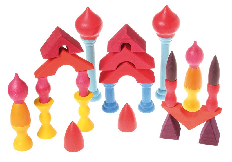
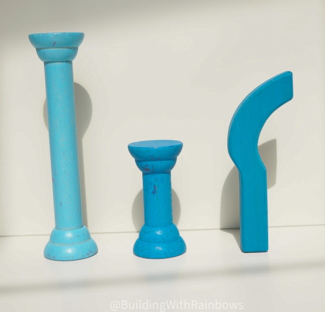
The light blue posts in the Roofs and Pillars sets are nearly glossy, and the mid-blue ones don’t have the familiar grippy Grimm’s texture either. I’m not sure if there were any other pieces made this way—do you know of any?
What other changes have you seen in Grimms? I’d love to hear! Drop me a note below.
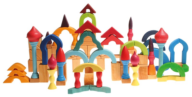
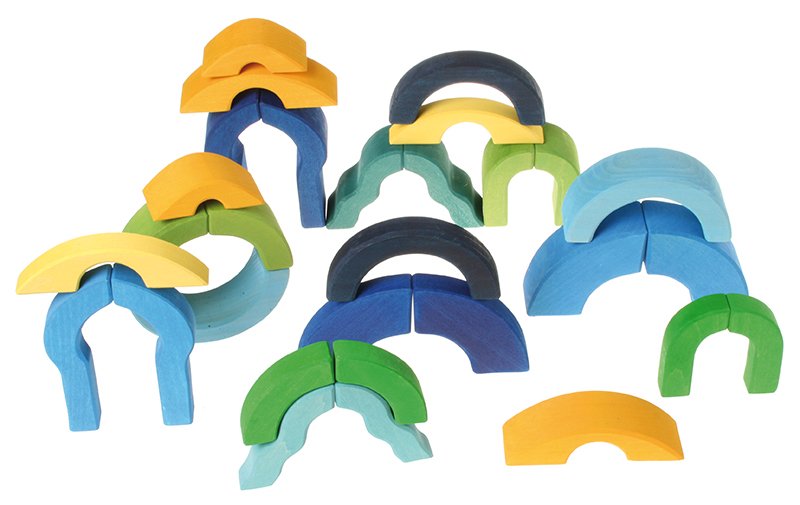
This is an old Grimm’s stock pick, here just because it is beautiful. This is the curves set and the roofs and pillars sets above + the natural geo blocks.
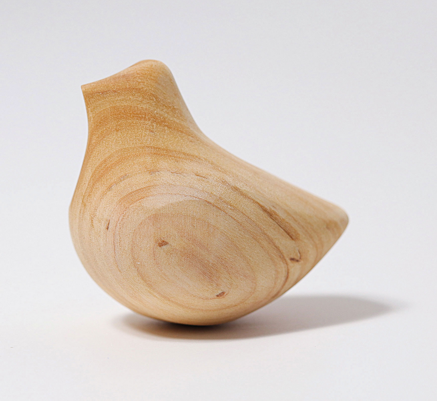
Interesting! We have that bird. didn’t know it was in the old logo! I am going to check our collections now. haha
Isn’t that cool? I’ve never seen the bird in person, but it looks so lovely to hold.